Productive Access
Author: Annie Cigic, Rhetoric & Writing Studies Doctoral Program, Bowling Green State University
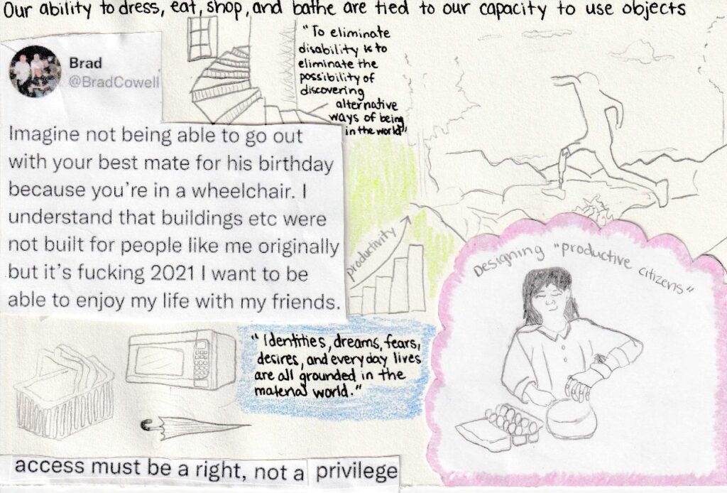
This is a collage art piece. It welcomes viewers and readers to think about the everyday objects they use, how those objects lead to productivity, and how objects measure our capability. Another consideration to think about is how objects enable us to participate in everyday activities such as cooking, eating, and shopping. But most importantly, how objects are not accessible and exclude people from our material world.
The collage is made up of written quotes, small illustrations of objects, one full tweet, and a line from a separate tweet, one person with a prosthetic forearm and hand cooking in a kitchen, and one person with a prosthetic leg jumping over rocks with a mountain view in the background. These images are up for interpretation by readers and viewers.
Image Description: This collage art piece is on a small sketchbook piece of paper. It is positioned horizontally. At the top is written text in black ink that says, “Our ability to dress, eat, shop, and bathe are tied to our capacity to use objects.” Underneath that to the left is a printed and cut out tweet from the user @BradCowell. The tweet says, “Imagine not being able to go out with your best mate for his birthday because you’re in a wheelchair. I understand that buildings etc were not built for people like me originally but it’s fucking 2021 I want to be able to enjoy my life with my friends.” Above the tweet is a pencil illustration of a winding staircase. Next to the illustration is a quote that is written in black ink. The quote says, “To eliminate disability is to eliminate the possibility of discovering alternative ways of being in the world.” To the right of that quote is an illustration in pencil. There are two small trees, line work to create the appearance of rocks or rocky land. In the background are mountains and clouds. In the center is an outline of a person with a prosthetic left leg jumping through the center of the illustration. Below this illustration is another pencil illustration. It is originally on printer paper and cut out and taped to a sketchbook piece of paper. The illustration is of a person with short dark hair and a chef coat. They have a prosthetic left arm. They are using the arm to reach into a bowl. To the right of the bowl is a package of eggs. Above this person’s head is writing in pencil. It says, “designing ‘productive citizens”. To the left of this illustration is another quote in black ink. The quote says, “Identities, dreams, fears, desires, and everyday lives are all grounded in the material world.” Above the quote is a small bar graph with five bars. They rise higher and higher. There is an arrow indicating an increase as it is drawn from the left to the right increasing in height. Above the arrow is the word “productivity.” Below this and to the left of the previous quote are pencil illustrations of three everyday objects. They are a shopping basket, an umbrella, and a microwave. Below the pencil illustrations of the objects, there is a line from a tweet. It is printed out and glued to the paper. The single sentence says, “access must be a right, not a privilege.
Plain Language Practices in the Writing Classroom
Author: Annie Cigic, Rhetoric & Writing Studies Doctoral Program, Bowling Green State University
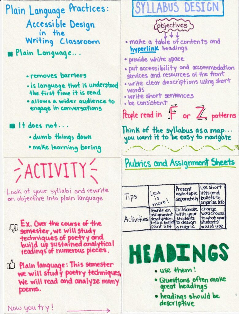
This is a mini-series on sketchbook paper outlining what plain language is and how it can be adapted to the classroom.
Image Description: There are four small pieces of sketchbook paper. They form a square with two pieces on the top and two on the bottom. They are meant to be read and viewed starting with the top left, then right, then bottom left, then bottom right. The top left piece has text written on the top. It is written in blue marker. The text says, “Plain Language Practices: Accessible Design in the Writing Classroom”. Below this is a small green bullet point shaped as a square. It says, “Plain Language…” then below that are three smaller bullet points. The text reads, “removes barriers”, “is language that is understood the first time it is read”, “allows a wider audience to engage in conversations”. Below that is another square bullet point. It is aligned to the right. The text says, “It does not…” and then a list with two bullet points is below it. The text says, “dumb things down”, and “make learning boring”. This is all that is on this piece.
The next piece in the series has “Syllabus Design” written at the top in purple marker with a blue marker outline. It is centered at the top. Below that is a bubble shaped like a cloud, and in the bubble is the word “objectives” with three small arrows pointing down. There is a bullet point list with six points. They read as the following: make a table of contents and hyperlink headings, provide white space, put accessibility and accommodation services and resources at the front, write clear descriptions using short words, write short sentences, be consistent. Below these six points is more text written in a raspberry marker color. The text reads, “People read in F or Z patterns.” The F pattern indicates people skim right, then down, then right, then down. The Z pattern indicates someone skims by going right then diagonally left, then right. Below these F and Z patterns is text written in green marker. The text says, “Think of the syllabus as a map…you want it to be easy to navigate”.
The next piece in the series has “Activity” written in the raspberry marker color at the top. It is centered and larger than the rest of the text. Below this is more text written in a darker purple marker. The text reads, “Look at your syllabi and rewrite an objective into plain language”. Below this there is text that reads, “Ex. Over the course of the semester, we will study techniques of poetry and build up sustained analytical readings of numerous pieces.” This is the example of an objective that can be rewritten into plain language. Next to this example is a thumbs down. Below this example is the text written into plain language with a thumbs up next to it. The text reads, “Plain language: This semester we will study poetry techniques. We will read and analyze many poems.” Below this rewritten example is text that reads, “Now you try!” with a long arrow pointing to the next and last piece in the series.
The last piece in the series has text at the top written in green marker that says, “Rubrics and Assignment Sheets”. Below this are two columns and four rows. I will write them as rows. The first row says, “Tips, Less is more!, Present each topic separately, Use short lists and bullets to organize info.” The second row says, “Activities, rewrite an assignment description into a bullet point list, collaborate with your students to design a rubric, change word choices to what your students would use.” This table is meant to mimic a rubric design and it gives tips and activities for designing rubrics and assignment sheets in plain language. Below the table is giant green text written in marker. The text reads, “Headings”. Below there are three bullet points. The text reads, use them!, questions often make great headings, headings should be descriptive.” This is the last piece in the mini-series. Thank you for viewing and reading!
I’m working on a revision of a course design right now, I needed this presentation and didn’t realize it! I…
I’m working on a revision of a course design right now, I needed this presentation and didn’t realize it! I will definitely keep plain language in mind for the syllabus and also, I did not realize reading patterns were F and Z shaped. If I use canva or other resources for assignment sheets, I will be sure to consider graphic placement so it doesn’t obscure the content.